
- dev
- ops
- football
- making lists
Categories
Archives
- April 2013 (1)
- November 2010 (1)
- March 2010 (1)
- December 2008 (1)
- October 2008 (1)
- September 2008 (1)
About
sayap is a code monkey who writes long ticket description and even longer commit message to bore future maintainer to death.
sayap lives in Malaysia, and follows timezone
EPL/Arsenal.

Basic UVD support v2 for Radeon on Gentoo
April 07, 2013 at 08:53 AM | categories: linux | View CommentsHere's a simple step-by-step guide for Gentoo users to start testing the newly released UVD support in the open source Radeon driver:
- Buy something from AMD/ATI. Be a good open source citizen and vote with your wallet! Some good candidates include this and this.
- Feel good about yourself.
- Wait several years for AMD developers and lawyers to get their collective shit together. Use the shitty proprietary Catalyst driver in the meantime.
emerge --sync.- Say goodbye to x11-drivers/ati-drivers, replacing it with x11-drivers/xf86-video-ati. Make sure it says "radeon" instead of "fglrx" in the
VIDEO_CARDSflag. - Install media-libs/mesa-9.2_pre20130404 and x11-drivers/radeon-ucode-20130402 kindly and promptly prepared by chithanh. All hail chithanh.
- Grab the latest kernel source from the drm-fixes-3.9 branch. This tarball should work.
- Apply all 11 patches from patchset v2 posted in the mailing list. Alternatively, apply this rolled-up patch.
- Build kernel. Make sure to set
CONFIG_DRM_RADEONand add the relevant firmwares toCONFIG_EXTRA_FIRMWARE(e.g. "radeon/PALM_me.bin radeon/PALM_pfp.bin radeon/SUMO_rlc.bin radeon/SUMO_uvd.bin" for E-350). - Add "vdpau" to the
USEflags and recompile packages that make use of it. - Reboot. Join forums / IRC / mailing lists for group hug.
UPDATE: Patchset v3 is out in the mailing list. Essentially the same as v2, with one change moved from 02 to 03.
OpenVPN on OpenWrt for iptables noob
November 09, 2010 at 08:43 AM | categories: linux | View CommentsOpenWrt is a sweet distro for wireless routers. However, doing certain stuffs with it, e.g. setting up OpenVPN, is not an easy task. There are many wiki pages, forum threads, and blog posts to help us mortal to get OpenVPN running, but most of them involves a blood sacrifice to the God of Iptables as the mandatory first step. Iptables?? Surely there must be a less painful way?
After some trials and errors, I managed to get OpenVPN to work on OpenWrt, without typing any iptables command. Not everything can be done via the Luci web interface though, so expect to get your hands dirty with the command line. With that said, here are the steps for the typical road warrior setup (tested on Backfire 10.03).
-
SSH into the router, and install the necessary packages
opkg update opkg install openvpn luci-app-openvpn openvpn-easy-rsa -
Apply changeset 21641 manually. The change went in on 2010-05-31, so Backfire 10.03 doesn't have it. See this forum thread for more info.
nano /etc/hotplug2-common.rules # remove the "next" line in the tun/tap section -
Generate the keys following [this excellent guide] (http://openvpn.net/index.php/open-source/documentation/miscellaneous/77-rsa-key-management.html) from OpenVPN.
nano /etc/easy-rsa/vars # Scroll to the bottom and put in the country, province, city, organization, and email build-ca build-dh build-key-server server build-key-pkcs12 client1 -
Copy the following files into /etc/openvpn/. This is the default location, so they will get picked up automatically later.
cd /etc/easy-rsa/keys cp ca.crt ca.key dh1024.pem server.crt server.key /etc/openvpn/ -
Copy client1.p12 to the client machine (i.e. the road warrior). The client config file should look like this:
client dev tun proto udp remote <server address> 1194 resolv-retry infinite nobind persist-key persist-tun pkcs12 client1.p12 comp-lzo verb 3 ns-cert-type server tls-client tls-remote <the common name during the build-key-server step> -
Open Luci web interface, go to Service -> OpenVPN, and enable sample_server. Click Save & Apply.
-
Click the edit icon for sample_server. Click the Swith to advanced configuration link. Click the VPN options tab. Select Push options to peer from the Additional Field list, and click Add. Then, select custom and type route 192.168.1.0 255.255.255.0 (change this accordingly if lan is not on 192.168.1.0/24).
-
Go to Network -> Interfaces. Type vpn in the box and click Add entry. Change Protocol to none, and change Interface to tun0. Click Save & Apply.
-
Go to Network -> Firewall -> Zones. Click Add entry, and type vpn as the Name. Change Incoming Traffic and Outgoing Traffic to accept, and select vpn in the Networks list. Click Save & Apply.
-
Go to Network -> Firewall -> Traffic Control. Click the upper Add entry button twice. Select lan as Source and vpn as Destination, and then reverse the order. Click Save & Apply.
-
Go to Network -> Firewall -> Traffic Control again. Click the lower Add entry button. Type openvpn as the Name, and change Source to wan. Then, select Protocol from the Additional Field list, and click Add. Change Protocol to UDP, and type 1194 as the Destination Port. Click Save & Apply.
We are done. Once openvpn is started on the client machine, it should be able to access all the lan machines, and vice versa.
Screw Android, I am going Maemo
March 28, 2010 at 11:47 PM | categories: linux | View CommentsAs the first and only Maemo 5 device, Nokia N900 is simply amazing. Unlike other smartphones that give you thousands of silly Apps, with N900 you can have real, actual, full-length Applications.
For example, this screenshot below shows a fully ajax web application rendered and functioning nicely in the N900's MicroB browser:
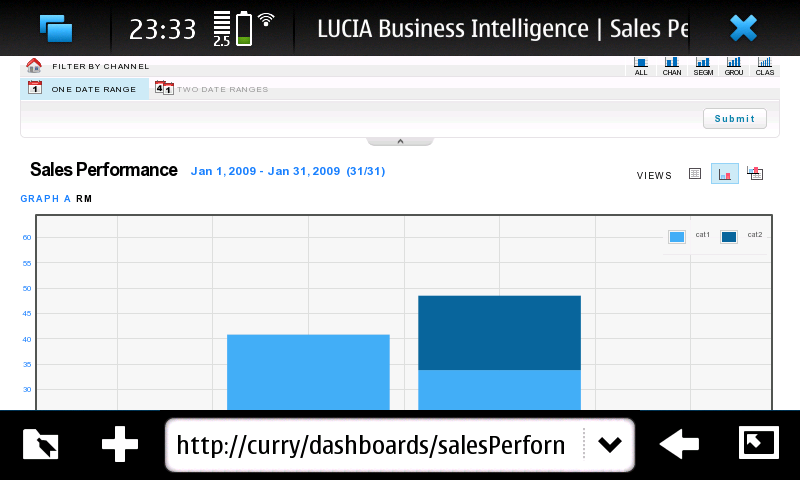
(Btw, that's our Business Intelligence Dashboards developed by my colleagues. Great work guys!)
Of course, this web application can certainly be rendered and functioning nicely with other smartphones also. What seperates N900 from the appsphones, however, is that it can actually host the backend of the web application, all by itself.
In this case, the backend uses these services:
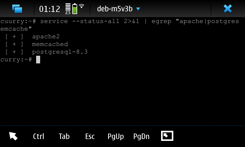
along with apache modules mod_wsgi and mod_php.
The speed isn't great, since N900's hardware spec is comparable to the laptop I had 10 years ago. Nevertheless, it works. So, screw Android with its non-standard Java and tiny SQLite database, I am going Maemo with N900 :D
UPDATE: After installing build-essential, all the latest and greatest versions of httpd, postgresql, and python can be compiled and run natively on the phone, without the chroot.
Installing a contrib module for Greenplum
March 12, 2010 at 12:49 AM | categories: linux | View CommentsInstalling a contrib module for Greenplum must be a dead simple task, because it was no where to be found in the otherwise comprehensive Greenplum Admin Guide.
However, google for "greenplum contrib" only returns one relevant result to a Chinese blog post, which despite best intention, only serves to discourage a newbie like me from ever trying to install a contrib. Recompiling postgresql and hand-editing Makefile just to install a small module? That just doesn't sound right, even for a Gentoo user.
After some messing around with a few contrib, I finally found the right way, which is indeed dead simple:
- Get any of the postgresql 8.2 source package from the official site
su - gpadmin- Unpack the source, then go to ~/postgresql-8.2.xx/contrib/xxx
make USE_PGXS=1 COPT="-Wno-error" install- (Optional for Greenplum MPP) Use gpssh to copy whatever .so file that just get installed under /usr/local/greenplum-db/lib/postgresql to other nodes
psql -f xxx.sql [DBNAME]
There you have it. Simple, no fluff, even an Ubuntu user can get it to work (seriously, I am not joking).
Garbage in, Xmltv out
December 31, 2008 at 04:48 AM | categories: boleh | View CommentsAs a follow up to my previous post, I am going to rant about my poor experience with screenscraping. Although the xmltv grabber, in its current incarnation, works with listings from The Star and Astro, the script was initially written to target the official websites for TV3/NTV7/8TV/TV9 (Media Prima) and RTM1/RTM2 (RTM).
To understand why the idea was ditched, here's a sample line of html from TV3 (reformatted for sanity):
<td> <a id="plcRoot_Layout_zoneCenter_ContentPlaceHolder_partPlaceholder_Layout_zoneScheduleContent_TV3ScheduleContent_ScheduleMain1_dlScheduleToday_ctl04_lnkShow" title="Date: Aug 19, 2008<br>Time: 10:00 AM - 10:02 AM" class="ScheduleLink" onmouseover="this.T_STICKY=false;this.T_WIDTH=300;this.T_FONTCOLOR='#000000';this.T_FONTFACE='Verdana';this.T_PADDING=5;this.T_BGCOLOR='#FFFFFF';this.T_TITLE='BERITA TERKINI';this.T_STATIC=true;return escape('Date: Aug 19, 2008<br>Time: 10:00 AM - 10:02 AM');" href="/Shows/MainNormal.aspx?MasterID=258&ShowID=322&MenuID=1&TemplateID=3" > BERITA TERKINI </a> </td>
It contains an id that is 150 characters long, multiple unescaped closing angle brackets, and some funky onmouseover code. Truely thedailywtf.com material. Oh ya, the html file with little content approaches 100K in size.
TRWTF about Media Prima websites, however, is the lack of consistency. All 4 sites appear to be running the same ASP.NET app, but subtly, each one is different:
-
It is
Schedules.aspxon TV3 and NTV7,ScheduleToday.aspxon 8TV, andSchedule.aspxon TV9. -
To get today schedules, you need to pass in query string parameter
view=todayto TV3, NTV7, and TV9. 8TV, of course, doesn't need it. -
NTV7 only contains partial listing and will truncate shows that have been aired from the list. TV9 contains partial listing but doesn't truncate. TV3 and 8TV contain full listing and doesn't truncate. IMHO, Media Prima should change one of them to contain full listing with truncation. Then we will have a permutation.
-
If you feel adventurous, you can probably get around the truncation by simulating ASP.NET's postback and using the lovely calendar widget that has number-of-days-since-2000-01-01 as its parameter. If you feel adventurous, and have too much time in your hands.
Bashing aside, one good thing about Media Prima is that they are not afraid to show you what's under the hood. I just checked the 8tv schedules and was presented with this error message, embedded in the page:
[Error loading the WebPart '8TVScheduleSubNavi']
C:\Inetpub\wwwroot\mediaprima\8tv\CMSWebParts\8TV\Schedule\8TVScheduleSubNavi.ascx(17): error BC30451: Name 'LinkHelperClass' is not declared.
Awesome.
In comparison, RTM website is surprisingly good.
-
Both RTM1 and RTM2 pages are consistent to each other. This is a small feat, but I have to mention it.
-
The date parameter follows ISO8601, i.e.
YYYY-MM-DD, unlike Media Prima websites that expect 3 parameters for day, month, and year. Kudos to the developers. -
The page size is 6 times smaller compared to Media Prima.
-
The listing follows the newspaper day (i.e. from morning until the next morning), rather than the actual day (i.e. from midnight to midnight). This is good usability.
-
It has reliability issue at times -- RTM1 listing is blank since 2008-12-28.
As for Astro website, there is nothing much to talk about. Overall, it is just OK.
-
Pages are consistent.
-
The date parameter uses the format of
DD-MON-YYYY. -
A day of schedules is splitted into 2 pages, one for AM, one for PM. This is cumbersome not only for the script to scrape, but also for an actual person to read.
-
Things like No Transmission and Transmission Ends are included as shows with start time and duration. This isn't really necessary.
-
The size of the page is 3 times bigger compared to RTM.
The Star website has its goods and bads, but still, it is the best among the bunch.
-
Pages are consistent.
-
The date parameter uses the format of
MM/DD/YYYY. Ugh. -
The listing contains columns for description and episode. This is a major plus. However, the episode column contains a mix of English words and Arabic numerals. It has to be more consistent.
-
The listing follows newspaper day (duh).
-
It spells SpongeBob SquarePants correctly. Shame on you, Astro.
Lastly, the web designers for RTM/Media Prima/Astro/The Star really need to start learning how to use CSS to properly separate content from presentation. Seriously. Let's just start by giving a freaking id (that is less than 150 characters) to the freaking schedules tables, so that I don't have to rely on some bizzare bgcolor attributes to identify them. Amen.